
User Interface Design
3 Weeks
Figma, Webflow
This project was about applying knowledge of web layout and user interface design towards a rapid visual design sprint. Focusing on the researcher side, our goal was to drive more user conversions while achieving business goals. For this design sprint, I redesigned the landing page for Honeybee, a platform that can be used by both research institutions and participants.
When analyzing the current landing page, it includes must-have elements: a clear call-to-action, the benefits of the product, and providing testimonials to support the credibility of the business. Keeping this in mind, the main areas of improvement focused on iterating the copy that will drive SEO and creating visuals that represent a fluid, simple, and neo-medical design.
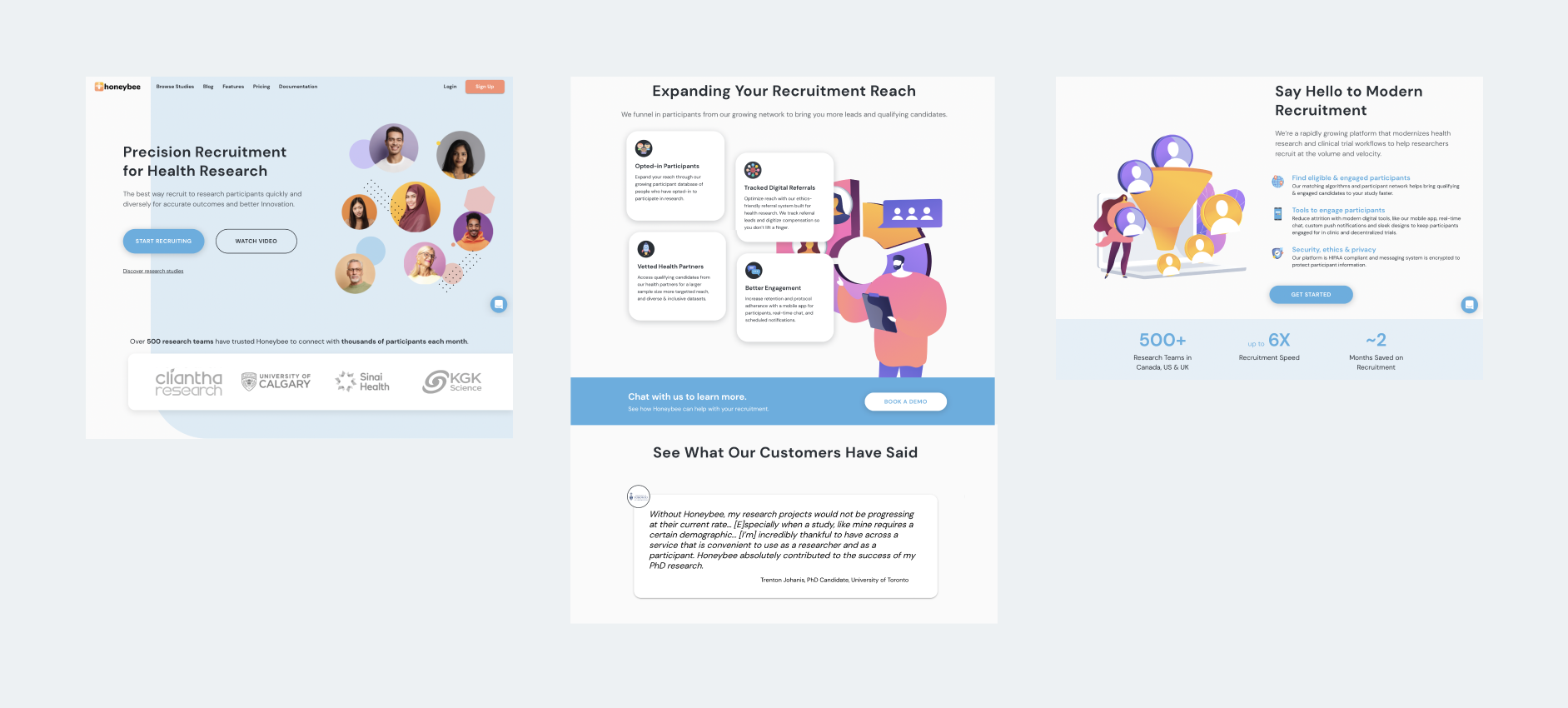
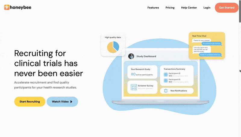
Current view of the researcher landing page
Wireframing first helped me to prioritize the elements on the landing page and get feedback from the team. Making the wireframes on Figma, I ended up refining the landing page once more before jumping into Webflow.
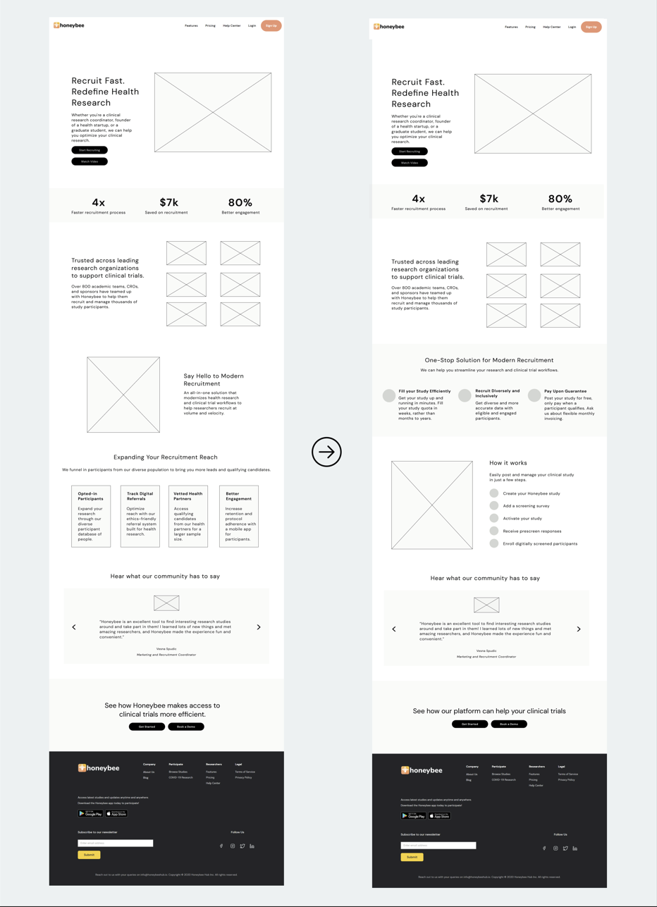
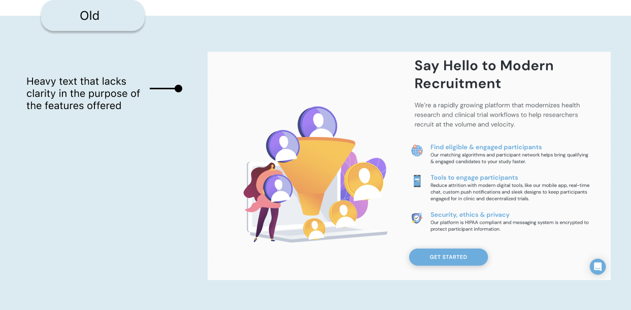
Moving on to Webflow, I started designing the hero section first. Being the first thing people see when visiting the website, it was important to design the hero section that will immediately speak on what Honeybee offers along with the benefits. I followed a standard concept of a two-column layout with text and call-to-action on the left side, and image on the right. I began to think about how to write a copy that prioritized Honeybee's values and work to support sponsors with recruiting quality participants. In my redesign, I tried to highlight those values right away.
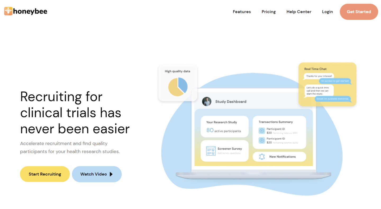
The CTA is one of the most crucial elements that needs to be addressed on the landing page as the CTA tells users what to do. Immediately, the user can identify what Honeybee is and what they offer, and are able to Start Recruiting. If the user requires more details, there is a Get Started CTA button placed in the navigation bar.
Throughout the landing page, I wanted the copy to be short and concise, so that the information is easily digestible for the users. I utilized the white space to keep the design minimal and to call attention to the blocks of information within each section. I moved the metrics section right below the hero section to show statistics on how Honeybee has helped existing users. The section following shows various academic and research organizations that have worked with Honeybee, increasing creditability of the product.
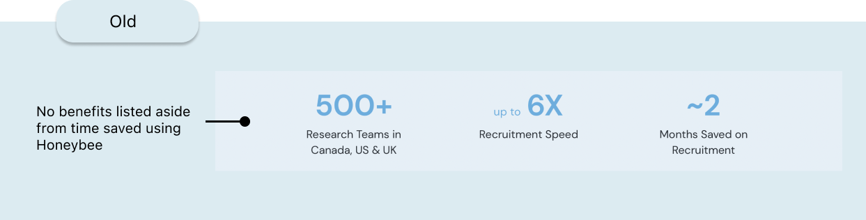
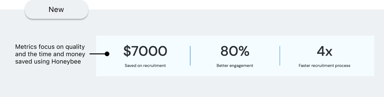
I moved the metrics section up to show statistics on how Honeybee has helped existing users and created a separate section instead to show the various academic and research organizations that have worked with Honeybee, increasing overall creditability of the product.
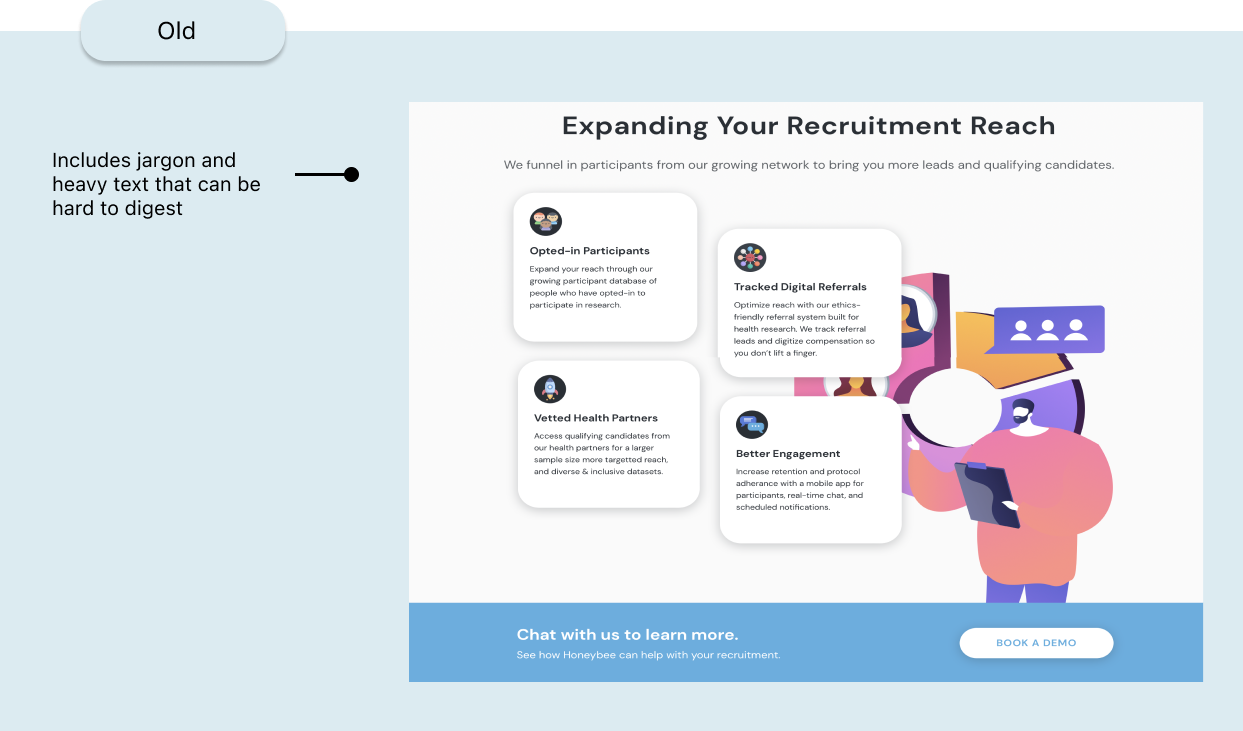
I updated the copy in the subsequent sections to only include what researchers and sponsors care most about when it comes to clinical trials - whether they can recruit qualifying participants before their deadline.
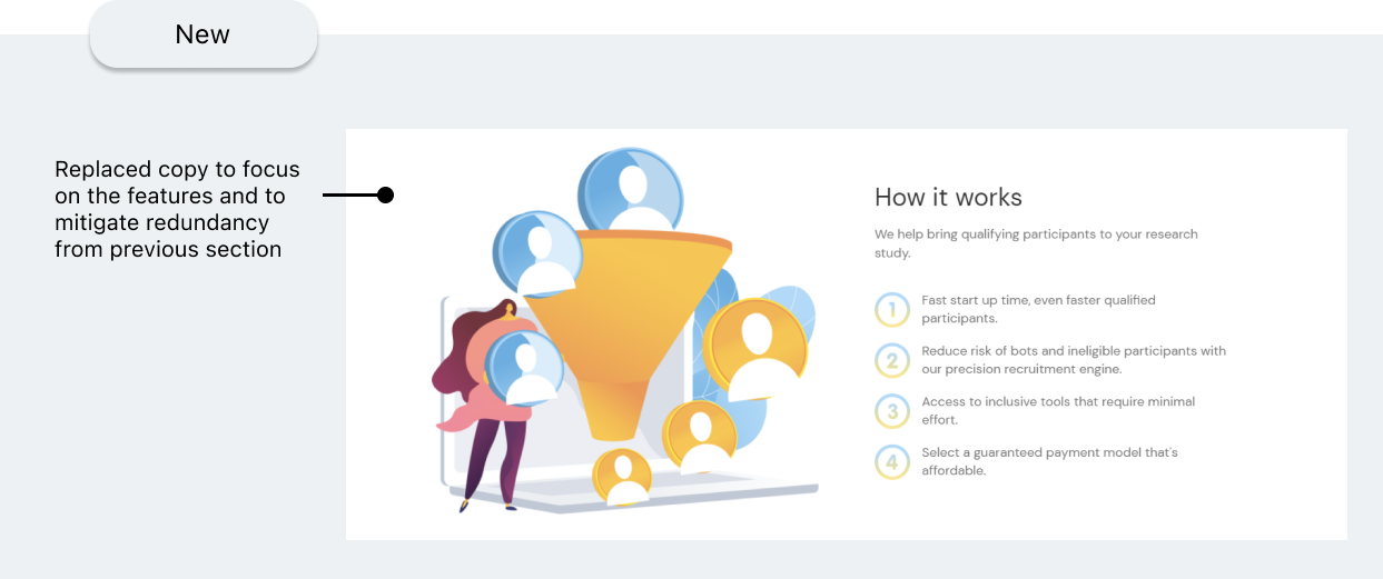
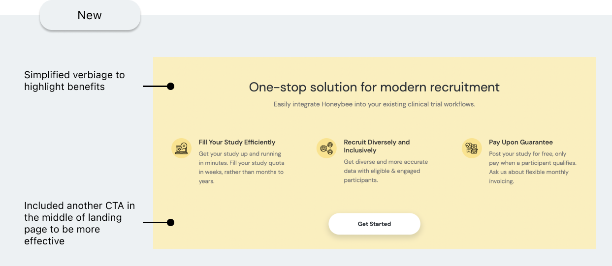
Moving on, I included a 'How It Works' section to answer: how Honeybee is beneficial to your job compared to the status quo of recruitment methods.
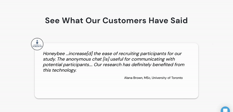

Next I added testimonials, which gains the user’s trust and gives them the confidence to act on the CTA following the testimonials section. In addition, I decided to include buttons so users can freely navigate through each testimonial.
With this project, I had the opportunity to explore Webflow for the first time. I enjoyed the fact that I was given autonomy to build the landing page and experiment with all the features Webflow had to offer. In addition, using Webflow saved a lot of time for the developers on the team as there's minimal to no coding required.
If you like what you see and want to work together, get in touch!
ux.victoriakim@gmail.com