
User Experience Design
3 Weeks
Figma
Honeybee is a marketplace that connects researchers and study participants. Academic institutions, clinical research organizations, and health startups can post their study on the platform to accurately source and manage participants and facilitate more innovative research. On the participant side, users can take part in research studies to contribute to science and learn about their health, while earning rewards.
The purpose of this design sprint was to redesign the desktop version of the study search page in order to deliver a personalized experience and intuitive user interface for the participants. Specifically, propose a more engaging and seamless search experience so that users are comfortable browsing and joining research studies.
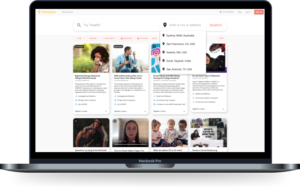
Current view of study search page
With the nature of the design sprint, I started off by gathering previous retention reports and user interviews to extract users' thoughts and pain points towards the current search experience. Most of the users preferred using the desktop, especially when completing longer tasks (i.e. surveys).
Other key insights I found:
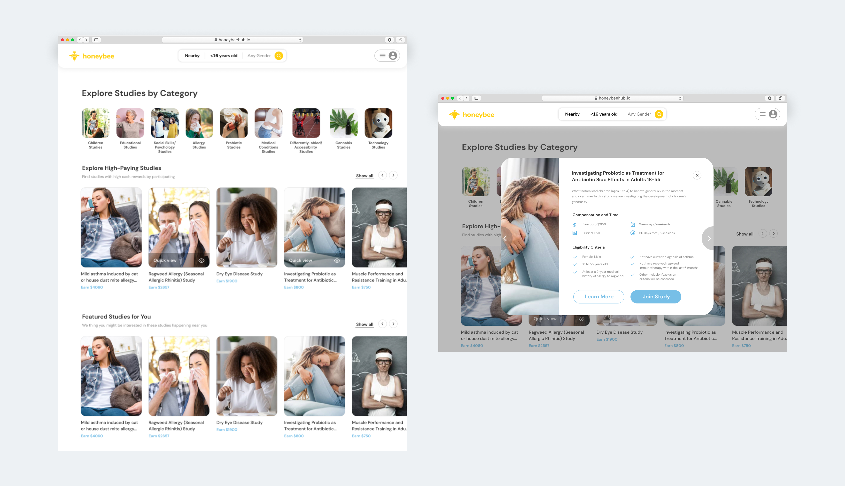
With these insights in mind, I created some iterations to the study pages. Users can view all the studies on Honeybee, but easily click on different categories that spark their interest. In addition, they can use the quick view feature to see if they are eligible to participate without having to go into full details of a study. This option would allow users to minimize the number of clicks throughout their search experience.
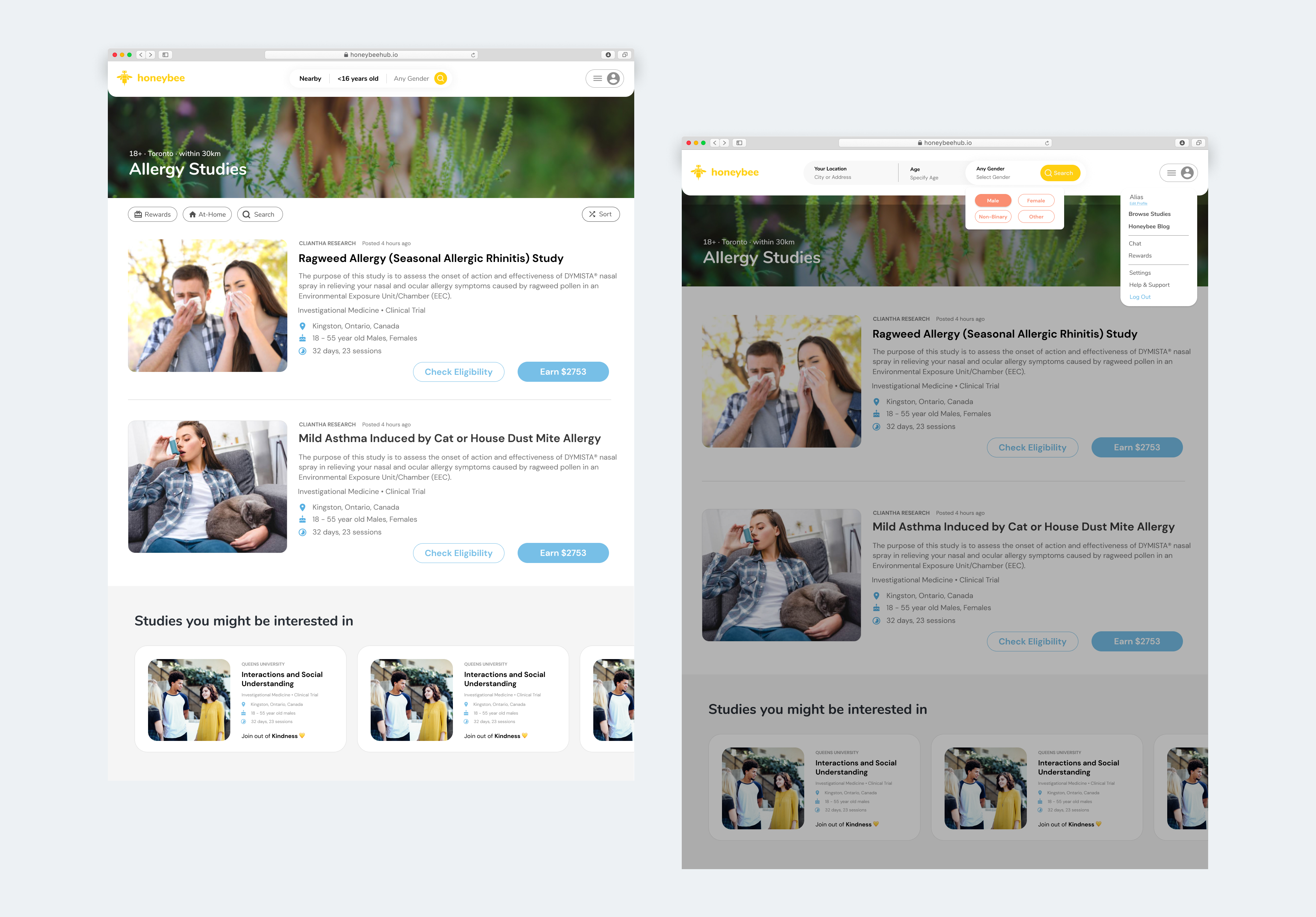
Once users find a category that resonates with them, they can click into the category and view all the relevant studies. In this case, the user has selected allergy studies, so all studies relevant to this topic will be listed.
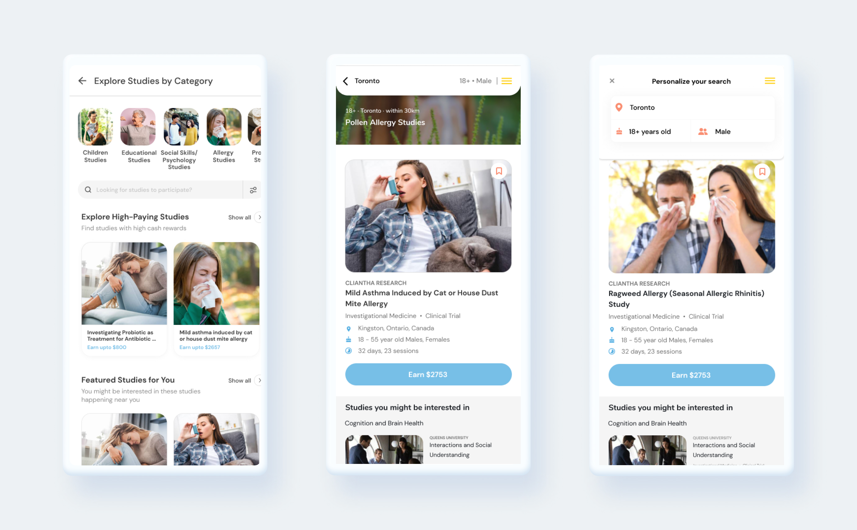
While the desktop version was the main focus for this design sprint, I created responsive mobile mockups as well.
If you like what you see and want to work together, get in touch!
ux.victoriakim@gmail.com