
User Interface Design
4 Weeks
Figma
The purpose of this project seeks to improve TD's mobile banking experience for seniors during the pandemic by conducting user interviews and through secondary research to gain an understanding regarding their thoughts and perceptions. From the research and initial brainstorm of ideas, our team derived early concept solution sketches relevant to the current challenges in order to create a fine-tuned digital experience for seniors.
I conducted 3 user interviews in total with participants over the age of 60 to get a better understanding of senior's thoughts, perceptions, and pain points. In addition, I ensured that each participant referred to at least one bank and had some level of proficiency when it came to mobile/online banking. Based on the user interviews, I generated an affinity map to extract some key findings that we would focus on while considering our design solution.
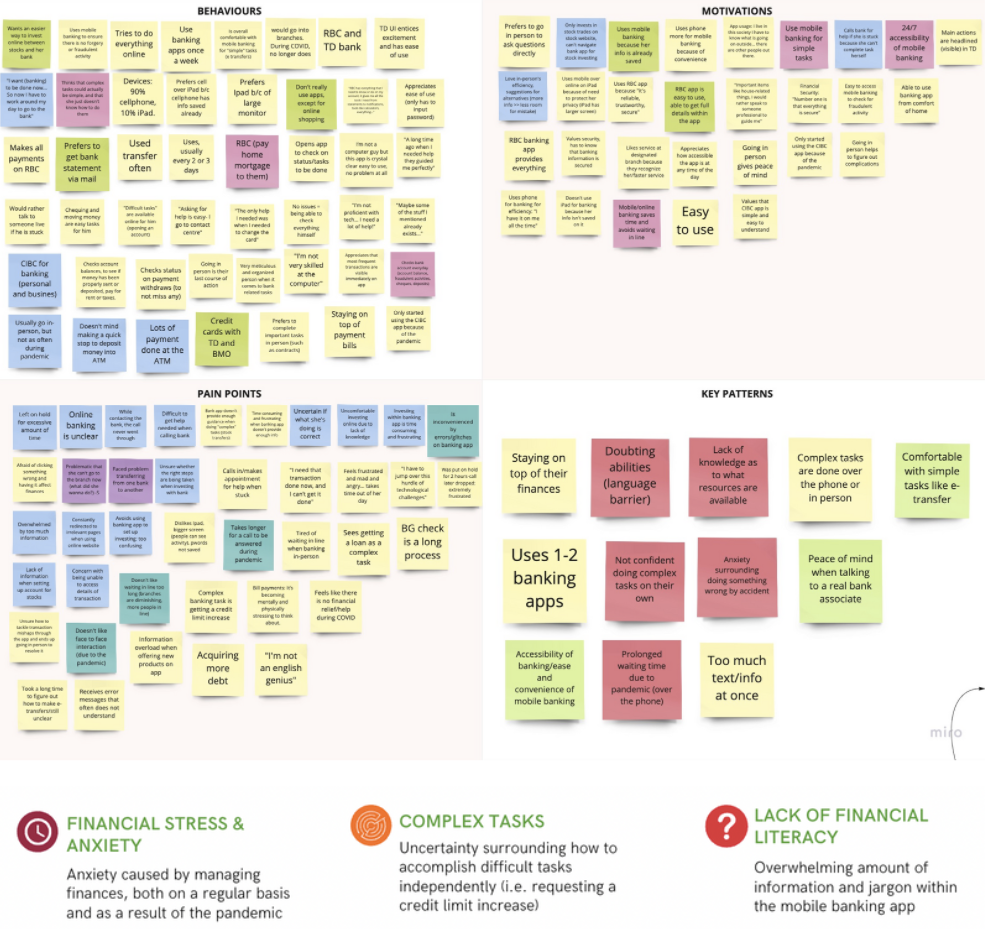
After analyzing the initial research I completed some supplementary research by reading through relevant new articles and scholarly resources surrounding elders and financial constraints to further support the findings. I found in a study conducted by Wichita State University, 62% of 228 seniors aged between 65 and 92 voiced concerns about budgeting, going over their credit limit, and using their credit card impulsively.
In considering the pain points from the interviews, I uncovered an area of opportunity to assist elders in obtaining a credit limit increase.
With this in mind, I narrowed down the scope with the following problem statement: How might we consider the various anxieties seniors have regarding their credit to create a more accessible, resourceful, and encouraging experience?
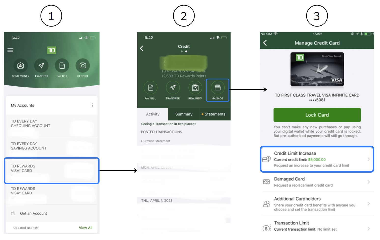
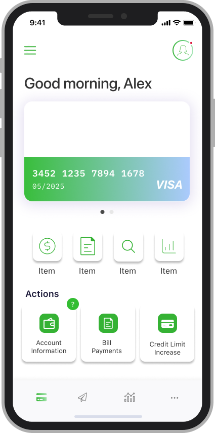
With the primary focus shifted towards improving the experience of obtaining a credit limit increase, it also made sense for our team to understand the current user journey of the TD mobile banking app with regards to requesting a credit limit increase.
The preliminary concept solutions were documented through a high level concept sketch, which allowed me to communicate various ideas and collaborate with stakeholders.
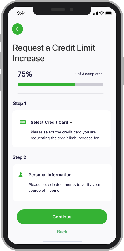
During the initial sketch, I was ideating around the solution to increase visibility and reduce the number of steps required when requesting for a credit limit increase. The solution would also include a set of guided pop-up instructions to provide detailed explanations while completing the task. These instructions can be dismissible with the use of iconography but readily available if the user needs assistance.
Furthermore, the initial sketch includes the improvement of TD's current chatbot system, along with the implementation of a live agent. Incorporating a live agent would ultimately seek answers to more complex questions that the chatbot may not be able to comprehend, and designed to make it easily transferrable from the chatbot.
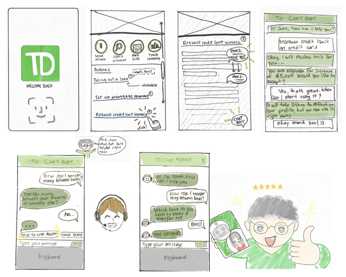
I shifted focus towards improving the overall visibility when obtaining a credit limit increase. As such, ssed the chatbot and live agent as these tools require a lot of financial resources and hence may not be feasible for the business. In addition, our d sketches would encourage users to be more individualistic in successfully completing tasks on their own accord.
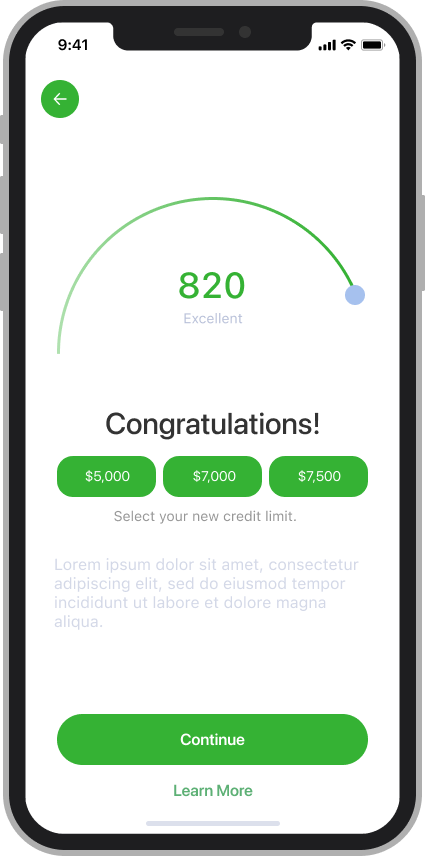
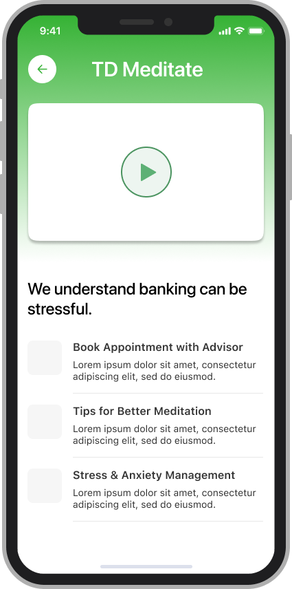
In the revised sketches, I made it easier for users to access information when requesting a credit limit increase and considered all aspects by adding a compassionate rejection for those who are not eligible. I also designed the sketch to include additional resources that would be available within the TD banking app to help users cope with financial anxiety and stress management.
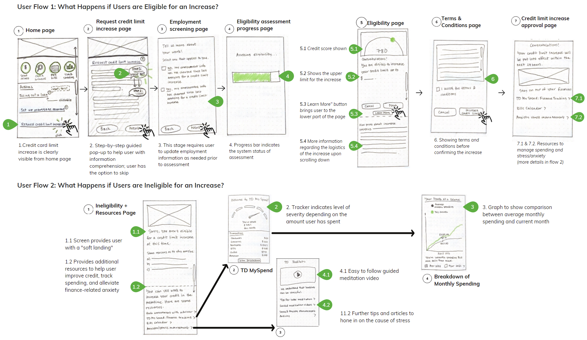
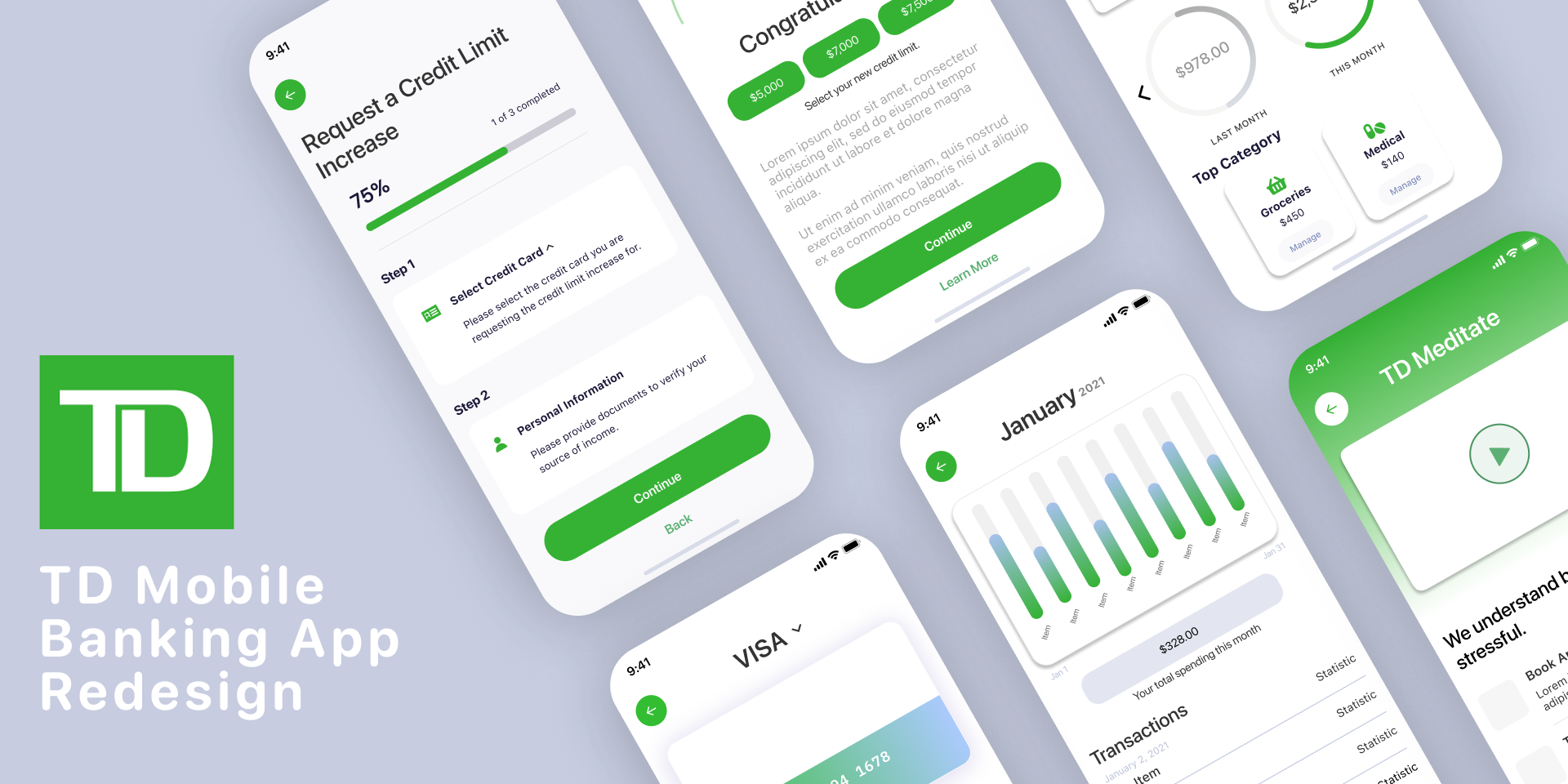
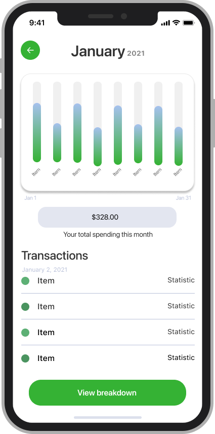
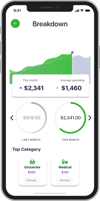
Using Figma, I created a series of mockups to demonstrate a highly functional interface most representative of the proposed end product. Such representations will also contribute to communicating informed design decisions with the stakeholders. In considering the next steps, I would work towards making the prototype interactive, which can then be used when conducting usability testing with participants to validate the interactions and obtain feedback for further iteration.
While working through this project, speaking directly to individuals of the older population shed a different perspective on the way in which common banking tasks and in-app features are more often difficult to execute. As such, understanding their frustrations was imperative to designing a solution that would effectively address these problems. I learned the importance of implementing feedback given from my instructor, as it helped to narrow our scope on tackling the more apparent issue our users expressed from the interviews. In addition, I was able to test out and develop my UI skillset while generating the mockups.
If you like what you see and want to work together, get in touch!
ux.victoriakim@gmail.com